
Colorado’s mountain towns are defined by a particular kind of landscape.
Pine forests stretch across ridgelines. Granite outcrops break through the soil. In late summer, dry grasses shift toward warm gold and rust. In winter, the entire landscape softens under snow and pale alpine light.
When designing a mountain home, color works best when it begins with these surroundings.
The most successful interiors rarely rely on trendy palettes or stark contrast. Instead, they borrow their colors from the land itself — tones that feel natural within the forest, the stone, and the changing seasons.
When that relationship exists, the house begins to feel less like a separate object in the landscape and more like part of it.
Many mountain homes benefit from walls that feel bright without becoming stark.
Pure white paint can sometimes feel too sharp in alpine environments, especially during winter when snow already reflects so much light into the interior.
Warmer whites tend to work better. These tones soften the brightness of natural light while still allowing rooms to feel open and calm.
Some of the warm whites we often use in mountain homes include:
These colors carry subtle warmth that pairs beautifully with wood beams, stone fireplaces, and wool textiles.
They reflect daylight gently and create a quiet backdrop for the natural materials common in mountain homes.


Green appears naturally throughout Colorado’s mountain landscape.
Ponderosa pines, spruce forests, and alpine meadows introduce layers of green that shift slightly with the seasons. Bringing some of those tones inside the home helps create continuity between interior and exterior.
Muted greens — sage, olive, and forest tones — work especially well in cabinetry, libraries, and powder rooms.
Some beautiful greens we’ve used in mountain interiors include:
These colors feel calm and grounded, particularly when paired with dark wood and unlacquered brass fixtures.
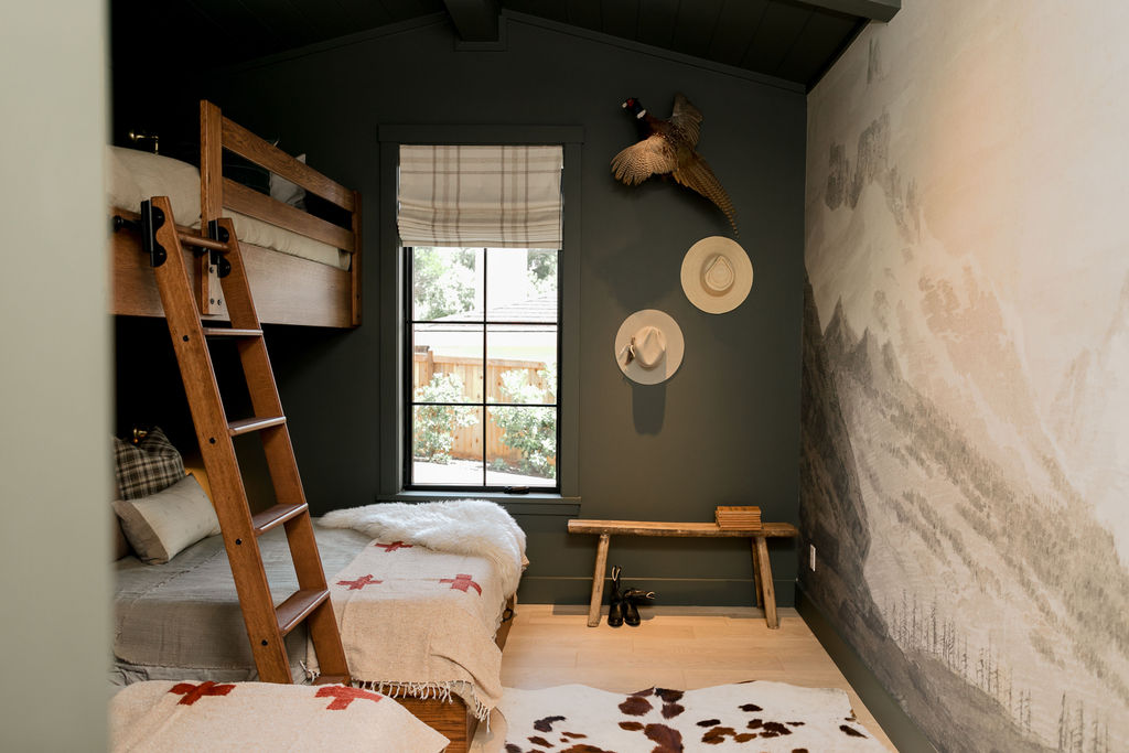
Mountain homes often benefit from darker colors in ways that suburban homes sometimes avoid.
Charcoal walls, black cabinetry, and deep accent spaces can introduce depth that balances the brightness of large windows and expansive landscapes.
Some of the darker tones we often use include:
These colors pair beautifully with leather furniture, stone fireplaces, and dark-stained beams.
In the evening, they also create a sense of intimacy that makes mountain homes feel particularly comfortable during long winter nights.


Colorado’s mountains are full of warm earth tones — clay soil, rust-colored grasses, and sun-warmed rock.
These colors translate beautifully into mountain interiors.
Rather than using them everywhere, they often appear in smaller moments: a study, a bedroom, or built-in cabinetry.
Some earth tones that work especially well include:
Used thoughtfully, these tones introduce warmth and depth while still feeling natural within the mountain landscape.
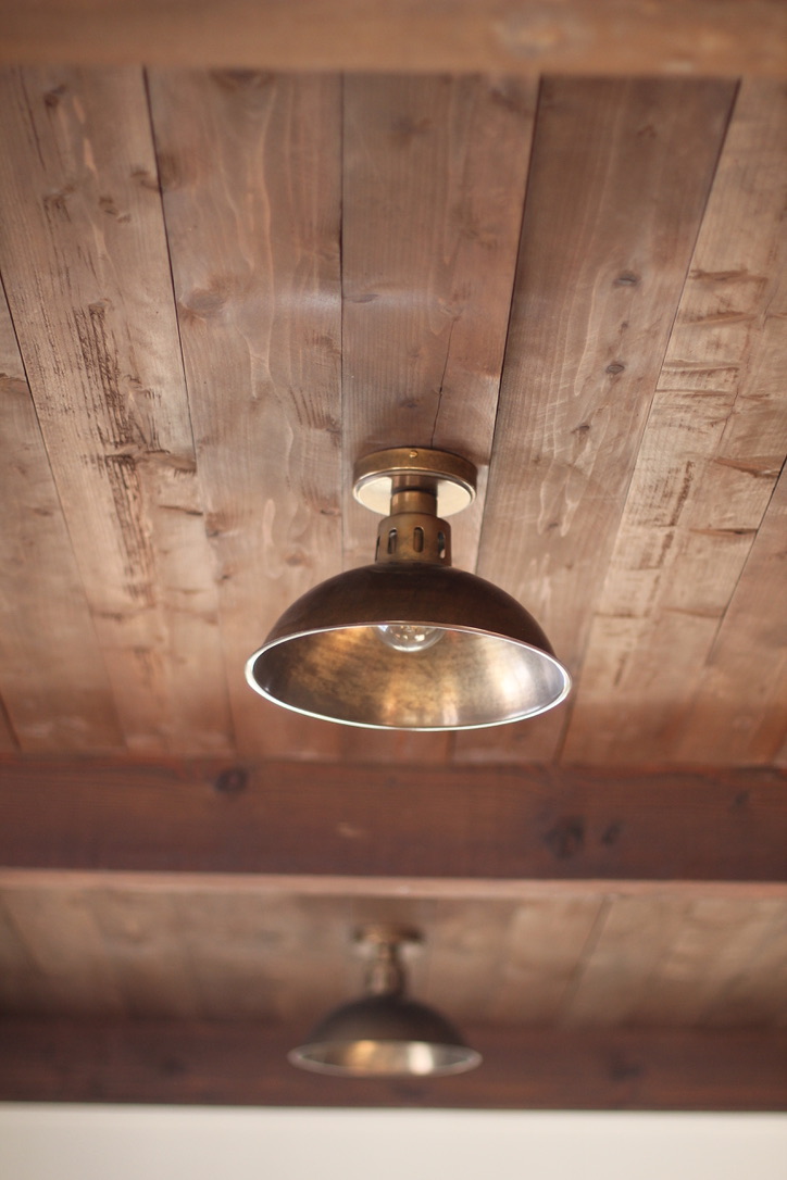
In mountain homes, wood often functions as both a material and a color.
Walnut cabinetry, dark-stained beams, and wide plank floors introduce rich tones that anchor the interior visually.
Dark woods pair beautifully with many of the paint colors mentioned above, particularly warm whites and charcoal tones.
Over time, these wood finishes develop even more character, giving the home a sense of permanence that feels well suited to mountain architecture.

One of the most common mistakes in mountain interiors is choosing colors that fight against the natural environment.
Bright cool whites, overly trendy gray palettes, and highly saturated colors can sometimes feel disconnected from the forest, stone, and alpine light outside.
Mountain homes tend to feel most comfortable when the palette remains restrained — colors that feel softened, weathered, or drawn directly from the land.
When the interior palette reflects the surrounding landscape, the home begins to feel less like decoration and more like part of the mountains themselves.
— Deco Vaquero